MATT GISIN

Reimagining Steam
UX Research & Redesign
Steam is the world's largest PC game distribution platform, with over 132 million active users. Despite its scale, the interface creates real friction — especially for users with accessibility needs. I ran an independent 12-week redesign project to address three core problems: information overload, ineffective recommendations, and poor accessibility.
Role
Tools
Type
Timeline
Product Designer & Researcher
Figma, Claude, v0, Google Stitch
Independent project
12 weeks
User interviews & heuristic evaluation
I interviewed 12 Steam users (ages 24–45, varying gaming experience and accessibility needs) and conducted a heuristic evaluation of the current interface. 8 out of 12 participants reported feeling overwhelmed by the homepage. Key themes that emerged:
-
Promotional banners dominated the homepage, causing decision paralysis
-
The recommendation engine felt generic and not tied to actual play history
-
Multiple overlapping navigation systems created confusion about where to click
-
Accessibility controls were hidden or too small to find without prior knowledge
Ludo
"There are multiple navigation bars that do completely different things, and I don't know where to click."
Paul
"I wish there was a way to easily increase the font size — the small text makes it really hard to read."
Kit
"I get overwhelmed with all the sales and promotions. I just want to find games similar to what I already play."
User Personas
Research pointed to two distinct user segments with different but overlapping needs. Alex (28, software developer) wanted faster, more relevant discovery without the promotional noise. Jamie (34, social media manager) needed accessibility-first design, screen reader compatibility, visible font controls, and filters for accessible games. Both personas shaped which problems I prioritised in the redesign.
Alex Thompson
28 | Software Developer | Chicago
-
Quote: "I want personalized recommendations without the clutter."
-
Goals: Quick discovery, Social gaming, Efficient navigation
-
Pain Points: Cluttered homepage, Generic recommendations, Poor social integration
-
Scenario: Logs in after work seeking a new game friends enjoy, but gets frustrated by the overwhelming interface
Jamie Rivera
34 | Social Media Manager | Seattle
-
Quote: "I need games that work with my screen reader. Accessibility shouldn't be this hard to find."
-
Goals: Discover accessible games, Advocate for inclusivity, Seamless assistive tech integration
-
Pain Points: No accessibility filters, Poor screen reader compatibility, Hidden accessibility features
-
Scenario: Searches for games with visual accessibility options but struggles to navigate Steam with a screen reader, resorting to external resources
Design
Key Design Decisions
Rather than redesigning everything, I focused on the discovery journey, from landing to search to recommendations, where research showed the most friction. Three principles guided every decision:
-
Reduce cognitive load by moving promotions to a dedicated area, and free up the homepage for relevant content
-
Personalise without overstepping through surface recommendations based on play history, with transparent controls over how data is used
-
Accessibility by default, not an afterthought, visible toolbar for font size, contrast, and caption options; filters for accessible games; diverse visual representation throughout
Wireframing
Before moving into visual design, I built low-fidelity wireframes to test the core structural changes to Steam's homepage and store experience. The wireframes focused on two things: establishing a clear information hierarchy that deprioritised promotional content, and surfacing accessibility controls as a first-class feature rather than a buried setting. The key decisions captured at this stage:
-
Moved the accessibility toolbar to a persistent, always-visible position at the top of the page
-
Reorganised the left sidebar to separate browse categories from feature-based filters, reducing scanning effort
-
Replaced the large promotional hero banner with a more contained featured section, freeing up space for personalised content
-
Added a "Browse by Feature" section to the sidebar, including captions, controller support, and co-op, making accessibility filters discoverable without requiring a search
To accelerate early exploration, I used Google Stitch to generate initial UI directions from prompts and wireframe uploads. I used these to test structural ideas and visual directions before committing to Figma. This compressed what would have been multiple iteration cycles into a single working session, letting me discard weak directions fast and focus refinement energy on the most promising layouts.


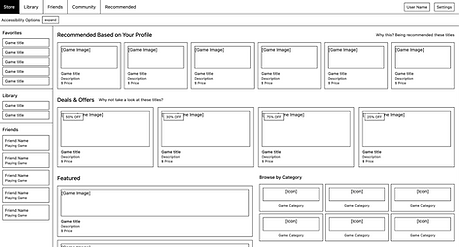

High-fidelity prototype
The high-fidelity prototype brought the wireframe decisions to life with full visual design, real game content, and interactive accessibility controls. The redesigned homepage is built around three principles that directly address the research findings.

Outcome & next steps
Reflection
This project reinforced something I think about a lot: accessibility isn't a feature you bolt on at the end. The users who struggled most with Steam weren't edge cases — they were 8 out of 12 people I talked to. Designing for the hardest use cases made the experience better for everyone.
Next steps
The redesign is currently at prototype stage and hasn't been validated against real usage data. The natural next step would be moderated usability testing with both casual and accessibility-focused users to measure whether the new navigation actually reduces time-to-discovery. I'd also want to A/B test the personalisation controls — there's a real tension between relevance and privacy that the current prototype doesn't fully resolve. On the validation side, deploying Hotjar on a live version of the redesign would let me measure whether users are actually engaging with the accessibility toolbar or ignoring it. This behavioural data would directly inform the next iteration. A short survey targeting Steam users with accessibility needs would complement the heatmap data with qualitative context.
12
Users interviewed across varying ability levels
8/12
Reported homepage clutter, becoming the primary design target
3
Core problem areas addressed through redesign